Website Redesign

Castlebrook Village Condominium

Castlebrook Village is a condominium corporation located in Ottawa, governed by a 5-member Board of Directors. These Directors are dedicated volunteers elected during the Annual General Meeting held each fall, and serving for a two-year term. The Board is responsible for approving all condominium rules, overseeing projects, and managing the annual budget. To ensure efficient day-to-day operations, the Board appoints a professional property manager. Formal meetings between the Board and the property manager are held monthly, with ongoing communication maintained via email to address issues as they arise.

photo of an castlebrook lane house
photo of a key holder with keys

Target Audience

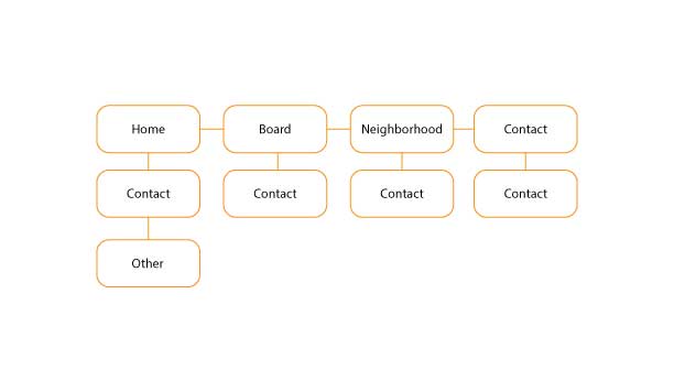
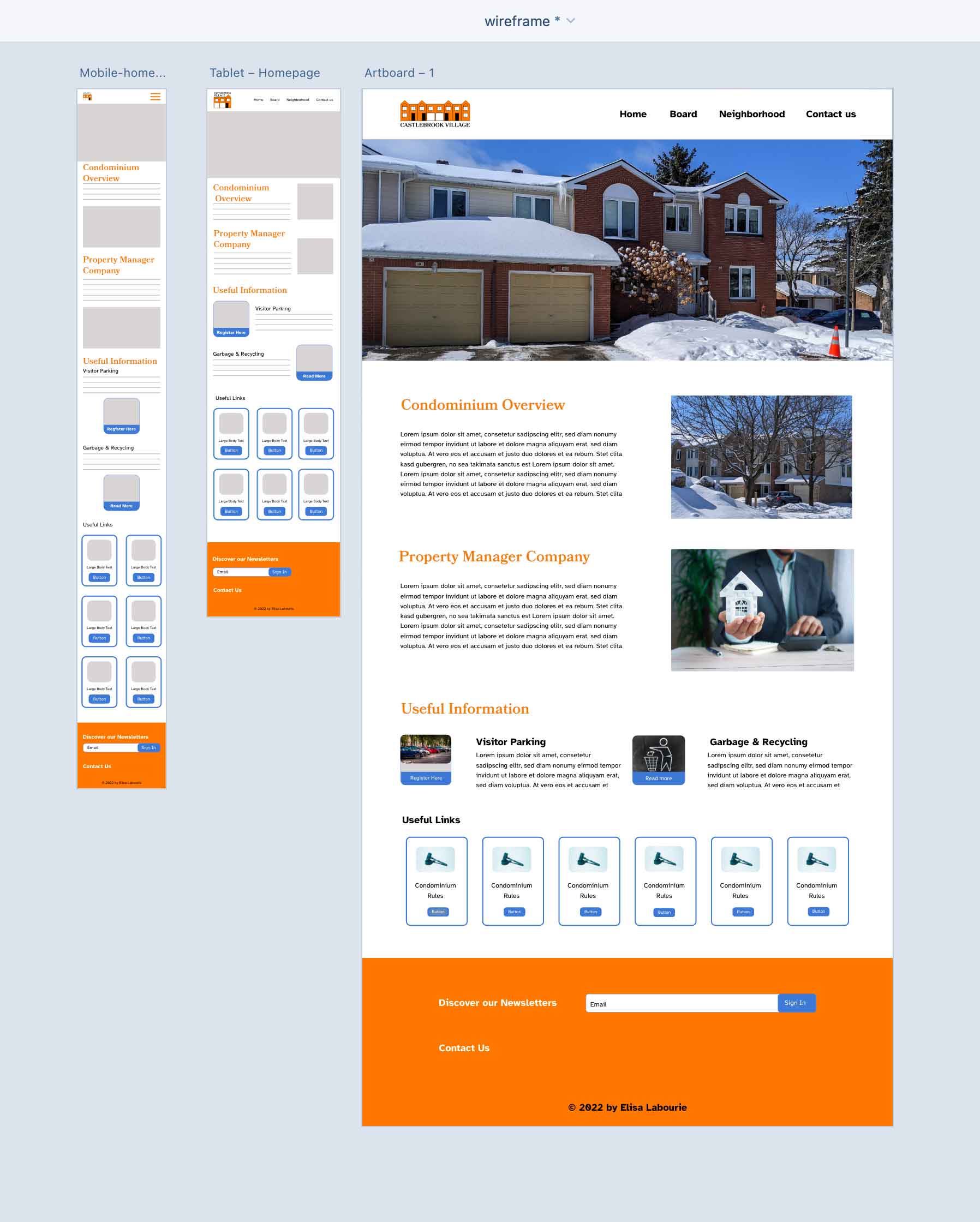
This volunteer-led initiative aims to modernize the Castlebrook Village website to better serve the community. The site resembled a newsletter and lacked mobile responsiveness and is being redesigned  using WordPress to create a simple, clean, and modern design.

The new website will be fully responsive and accessible across all devices, ensuring that residents —ranging in age from 30 to 80 can easily access important information about their property and community. The design will prioritize clarity, ease of navigation, and accessibility with a goal of fostering better communication and engagement within Castelbrook Village.

Concept

This volunteer project was undertaken to enhance digital accessibility and communication within the Castlebrook Village community. The initiative was carried out in two key phases:

  • Initial Development Phase: the website was firstbuilt from scratch to deepen my understanding of web development and improve mycoding skills. This phase focused on exploring the technical foundations ofwebsite creation, including layout design, responsiveness, and user experience.
  • Platform Transition Phase: to ensure long-term sustainability and ease of maintenance, the project transitioned from WordPress — a user friendly platform known for its accessibility and wide range of free tools and themes. This shift allowed future administrators to manage and update the site without requiring advanced technical knowledge. The final design is intentionally simple, clean and modern, tailored to meet the needs of a diverse audience.

The final design is intentionally simple, cleanand modern, tailored to meet the needs of a diverse audience. The site is fully responsive, ensuring seamless access across desktops, tablets and smartphones.

favicon
userflow map
content inventory of the website
screnshot of a old website
wireframes
A mockup of the new condo webpage look

Colours

The color palette for the Castlebrook Village website has been thoughtfully selected to reflect the values and spirit of the community.

  • Orange is used to convey emotional energy. It symbolizes creativity and vibrancy—qualities that resonate with the dynamic and collaborative nature of condominium living. Orange also helps foster a welcoming and engaging atmosphere for residents.
  • Blue represents openness, freedom and trust. These are essential qualities for a condominium board that values transparency, respectful dialogue and community involvement. Blue also evokes a sense of calm and reliability, reinforcing the board’s commitment to loyalty, depth and thoughtful governance.

Together, these colors create a balanced and inviting visual identity that supports both the emotional and structural dimensions of community life.

orange colour
blue color

Typefaces

The typography for the Castlebrook Village website has been carefully chosen to balance aesthetic appeal with accessibility, aligning with both the community’s character and the needs of its residents.

  • Bookmania is a versatile digital typeface family with a range of weights and styles, making it suitable for both  display and body text. It’s classic,  old fashioned charm compliments the traditional and welcoming atmosphere of Castlebrook Village, reinforcing the visual identity of the community.
  • Atkinson Hyperlegible was specifically designed to enhance character recognition and  improve readability—particularly for individuals with visual impairments. It’s clarity and legibility make it an ideal choice for diverse audiences which includes residents aged 30 to 80. This typeface ensures that all users can comfortably engage with the website content.

Aa Zz

Bookmania

Aa Zz

Atkinson Hyperlegible

Design