The Paper Bag Lunch Company was founded in 1975 as a small antique store on Jefferson Avenue, in Chicago. The Paper Bag Lunch Company began with a simple idea: offering toasty warm sandwiches to customers browsing the shop. What started as a thoughtful gesture quickly became a beloved tradition, evolving into a full-fledged eatery known for its delicious sandwiches, homemade desserts and vibrant live music.

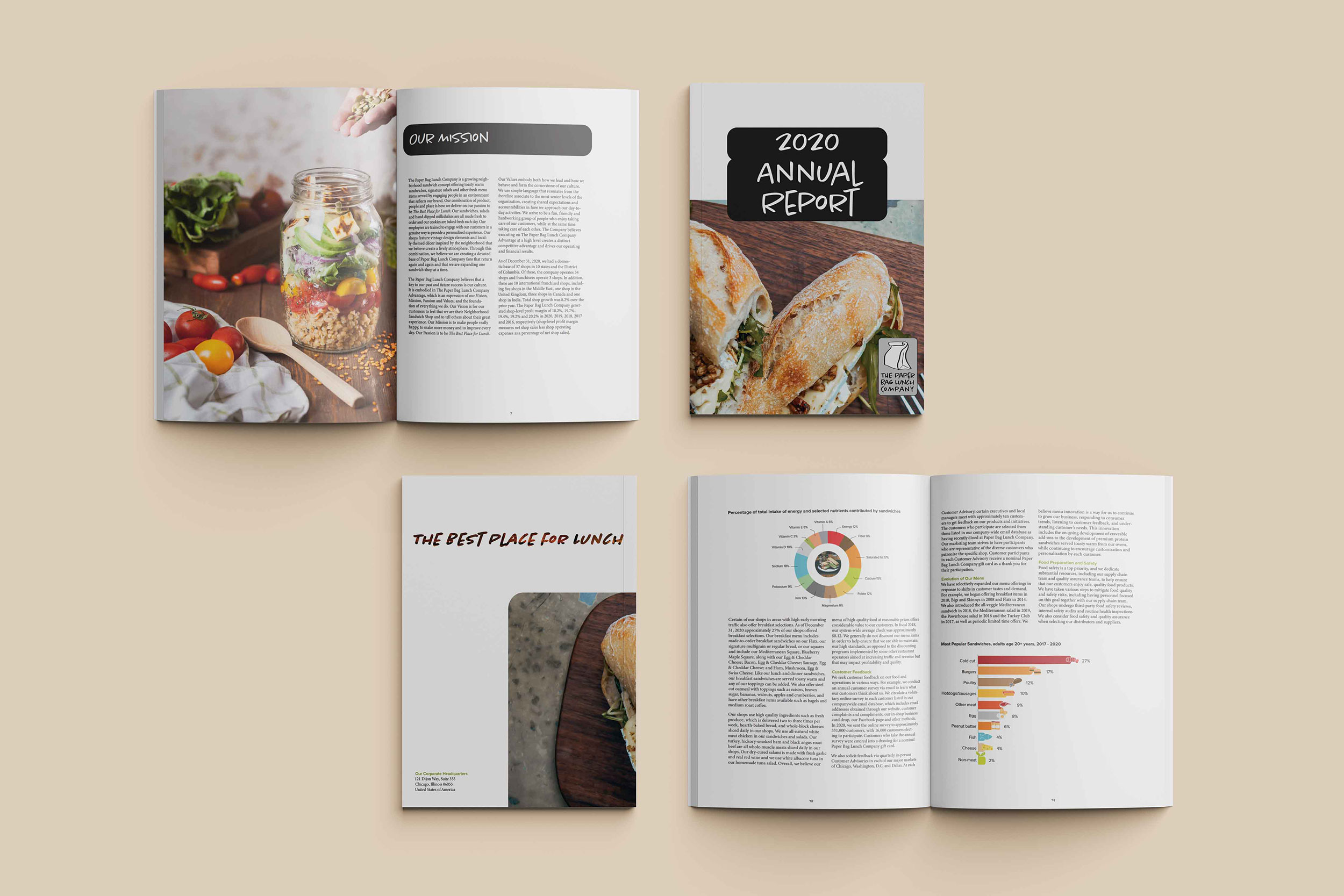
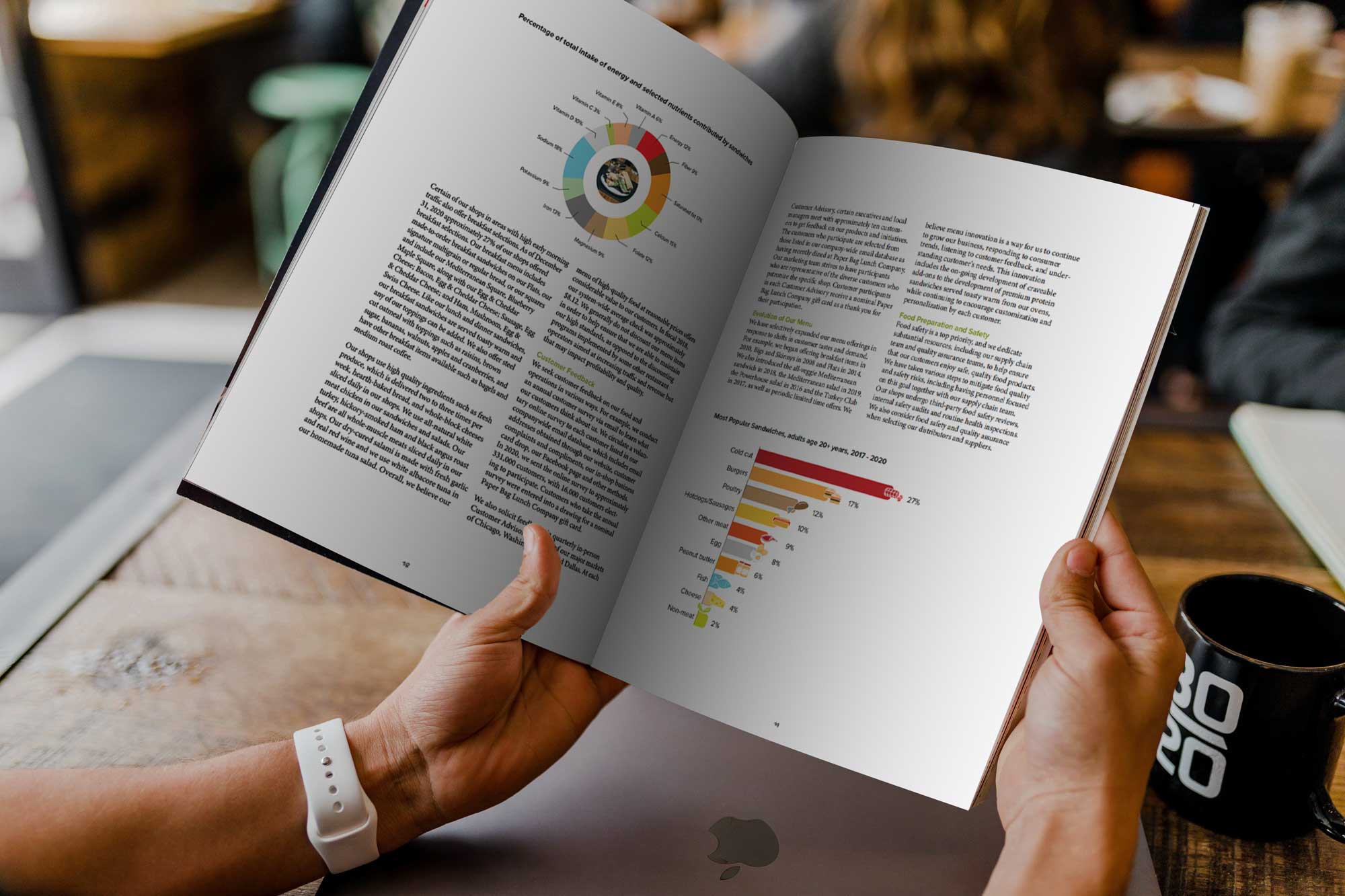
An annual report is more than just a financial summary -it’s a powerful marketing tool that reflects a company's identity, values and vision. It documents the organization’s activities and financial performance over the past fiscal year, while also serving as a key communication piece for shareholders and potential investors.
The goal of this project was to demonstrate my skills as a designer by creating a readable, visually engaging layout that balances clarity with creativity. The report incorporates well-designed graphs and data visualizations to make complex information accessible and compelling. Through thoughtful typography, layout and visual hierarchy, the design aims to build trust, boost shareholder confidence and attract newinvestors by showcasing the company’s achievements and future direction.


The font used in the logo is Chantal Light. Utilized for the primary brand mark, this typeface conveys elegance and refinement, aligning with the brand’s sophisticated visual identity
Section title: Proxima Nova bold 30pt reverse font.
Subtitle: Proxima Nova bold 10.5pt.
Body copy: Minion Variable Concept,regular, 10.5pt.
Section title: Proxima Nova bold 30pt reverse font. Employed for major headings, this typeface ensures strong visual hierarchy and prominence. The reverse styling enhances contrast and draws attention to key sections
Proxima Nova bold 10.5pt. Applied to secondary headings, this style maintains consistency and legibility across various content formats
Body text: Minion Variable Concept, regular, 10.5pt. Selected for its classic serif structure and superior readability, this typeface supports extended reading and contributes to a timeless, professional tone.
.png)