
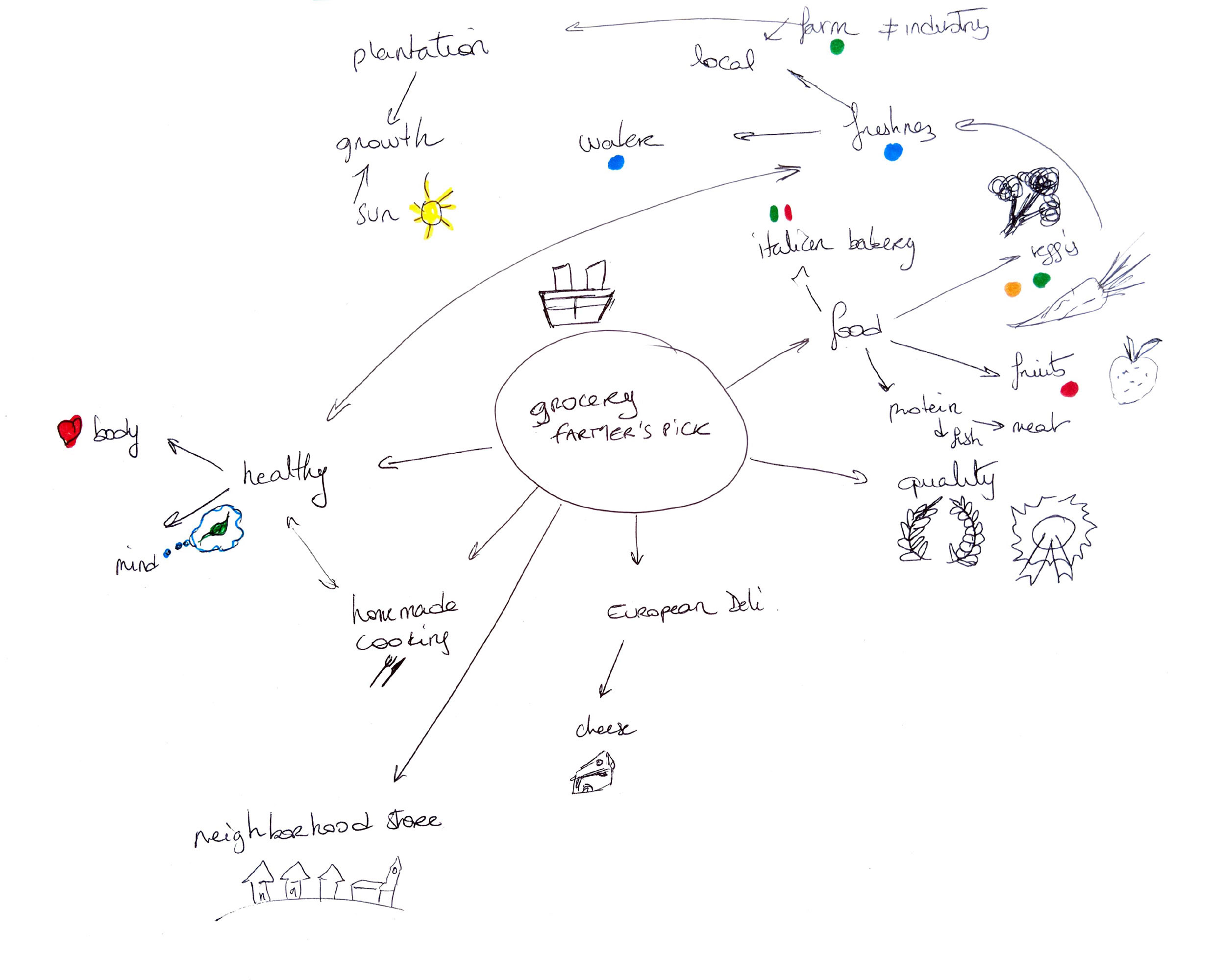
Farmer’s Pick is a welcoming neighborhood supermarket known for its old-fashioned customer service and commitment to offering the highest quality fruits, vegetables, imported groceries, cheeses, meats, and baked goods. Their mission is to provide affordable, fresh produce sourced from trusted local and international producers.
The objective of this logo redesign was to apply throughout research and creative problem-solving to develop a refreshed visual identity that reflects the brand’s values and appeals to its community-oriented audience. The new logo was designed with versatility in mind, ensuring it could be effectively applied across various mediums—from storefront signage to digital platforms like the website and social media.
The design style emphasizes warmth, freshness and trust, aligning with Farmer’s Pick’s dedicated to quality and personalized service.


The customers who shop at Farmer’sPick place a high level of trust in the quality and freshness of the food they purchase. They are often individuals and families who value healthy eating, sustainability and supporting their local economy.
Farmer’s Pick’s strategy centers on offering a wide selection of premium fruits and vegetables, catering to customers who prefer to shop locally to support small businesses and farms in their area. By prioritizing freshness, variety and community values, Farmer’s Pick strengthens its position as a trusted neighborhood market that delivers both quality and purpose.
The redesigned logo for Farmer’sPick incorporates a graphic element that symbolizes both freshness and intentionality. At its core, the logo features the shape of an apple, a universal symbol of health, nature and wholesome food-perfectly aligning with the brand’s focus on fresh produce. Embedded with the apple is the subtle outline of a finger, representing the act of carefully selecting and picking produce. This detail emphasizes the brand’s commitment to quality and the idea that every item is handpicked with care—reinforcing trust and authenticity.
Additionally, the logo subtly reflects the international dimension of Farmer’s Pick offerings, suggesting a global reach while maintaining a local, personal touch. This balance appeals to customers who value both global variety and local integrity in their food choices.


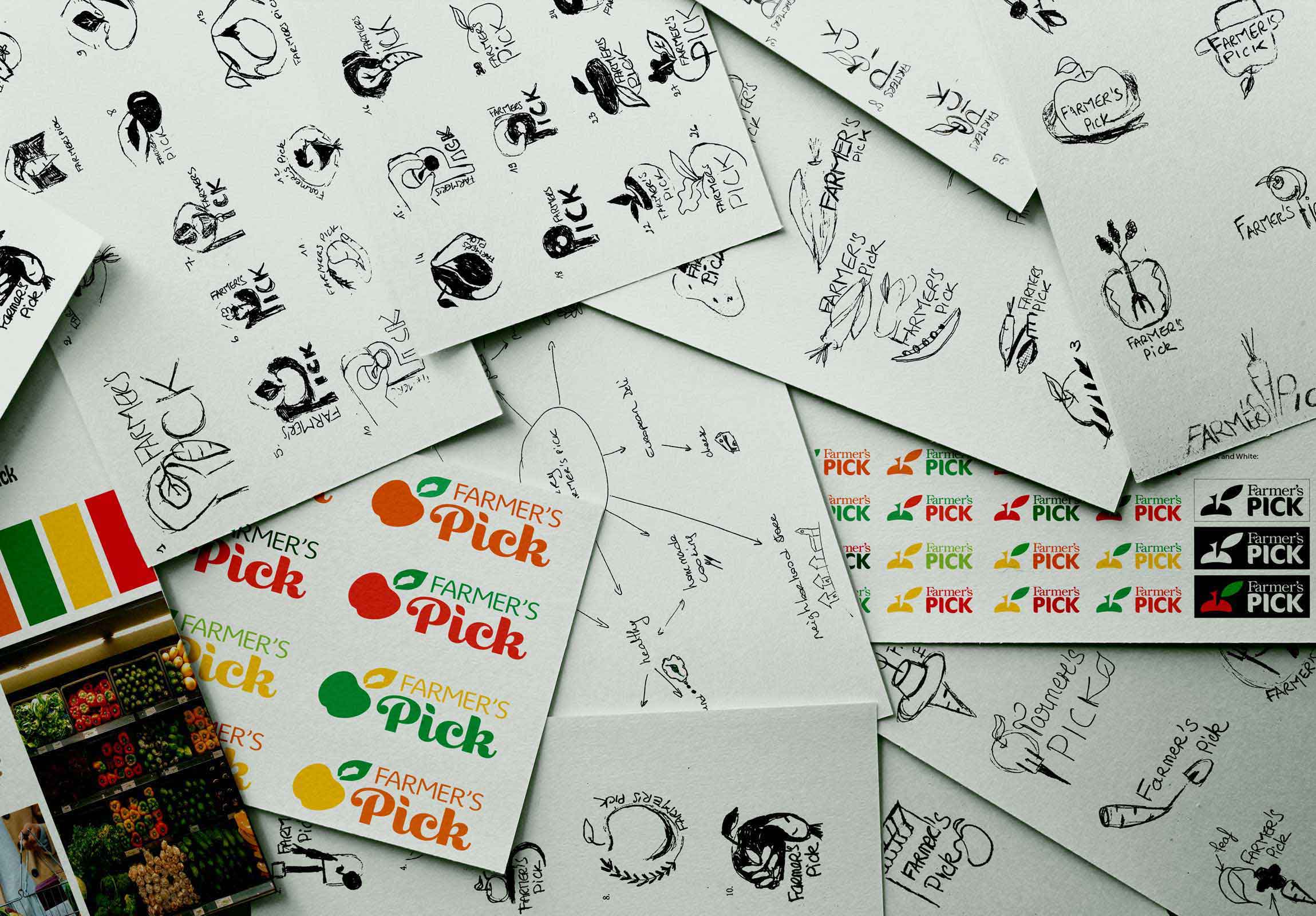
In this created logo, two main colors were used. The green represents the freshness and healthiness of the product. Associated with the red it imports an Italian cultural dimension related to their imported groceries that appeal to their target audience who are people with an international cultural background willing to eat fresh, healthy, and high-quality produces. The red is also here to stimulate the appetite of the target audience.
.svg)
The typeface chosen for the Farmer’s Pick logo is Nunito Sans, a modern sans serif font designed by Vernon Adams. It’s clean, round forms convey a sense of friendliness, clarity and approachability -qualities that align with the brand’s welcoming, community-focused identity.
Nunito Sans also reflects the brand’s values of freshness and environmental consciousness. Its modern and minimal aesthetic symbolizes cleanliness and simplicity, echoing the principles of sustainability and responsible consumption. This makes it an ideal choice for a business that emphasizes fresh, high-quality produce and supports both local and international farming communities.
